Major Marketing Catches for SaaS Projects

When it comes to marketing your SaaS project, there is no need to reinvent the wheel. Some strategies have been proven to work, some are usually a failure. Having developed hundreds of different SaaS projects, we have learned a number of important lessons about how to market them and ensure web design is optimized for conversion. While many marketing approaches have become common place — a video tutorial, a free trial, a call to action, etc., not all strategies are created equal. In this article we share our main findings from our own extensive experiences with the readers of our blog and our clients.
Communicate your value proposition in the titlePerhaps the most difficult thing you have to do is to formulate the right value proposition. You need to quickly and effectively tell people what makes your proposition valuable and what makes your business unique.
Take some time with your team and think about how you can position your project. Develop a list of suggestions and immediately rule out any that you don’t think will work. Test the ones you’ve chosen on a representative audience with the help of A/B-tests. Identify which of the key messages receive the best response and use this in all your advertising and marketing. Here is an example of an effective value proposition from DigitalOcean:
Form a call to actionDevelop a succinct call to action. Depending on your goals, you can focus on just one action, or add options, like Salesforce have done (watch demos, editions and pricing, Small business solutions).
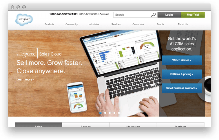
For other projects; however, it may be more important to focus on one particular action alone. This is exactly what Zendesk have done.
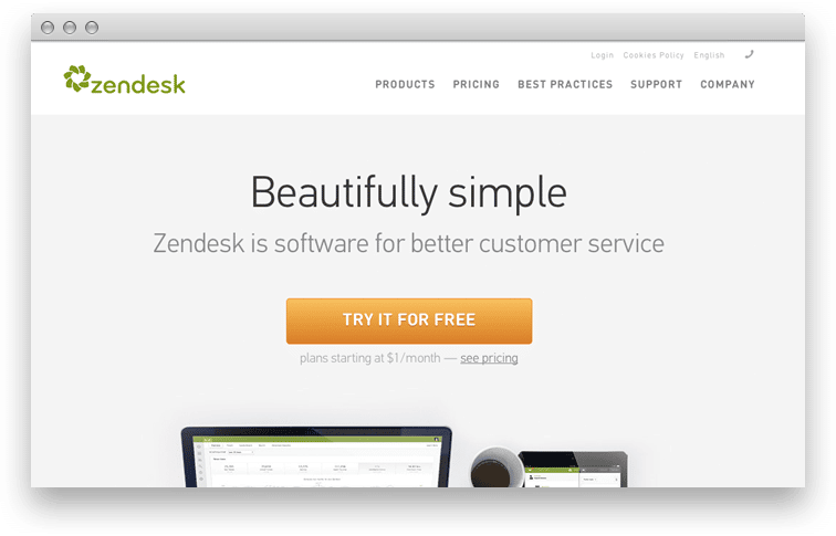
The words you use on the target button are very important. Some experts say that using a call to action that addresses the client’s problem can significantly increase the rate of conversion.
Add a photo of your productHave you ever bought a product without looking at it first? Most people haven’t. That is the reason why many companies place screenshots of their product on the home page.
However, there are some hidden pitfalls associated with the use of images. For example, you may attract the users’ attention to the image as opposed to the call to action and this may negatively impact conversion rates. Be careful with this, and remember: your picture should complement your value proposition, not draw attention away from it.
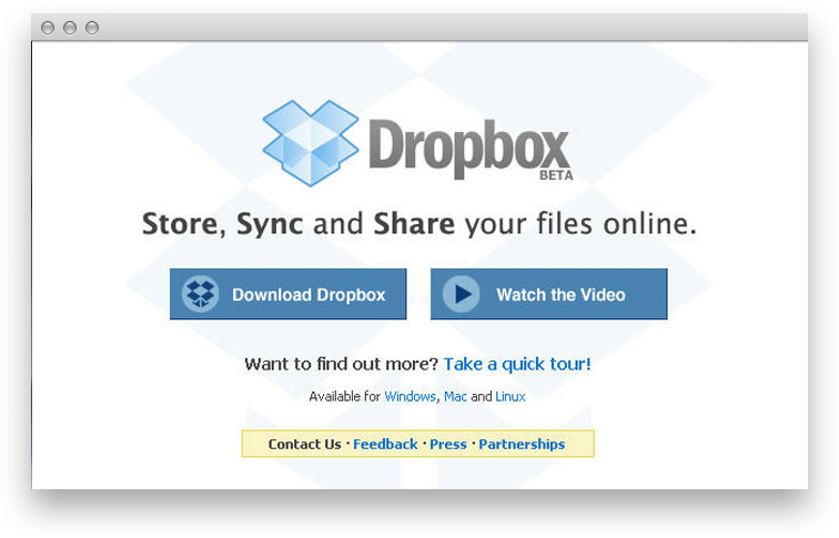
Record a videoVideo is a powerful motivational tool. It can convey the essence of the product more effectively than words. Sometimes a video becomes the only means to explain a concept, service or product. An example of a site that uses video to great effect is Dropbox. Their use of a video on the homepage quickly increased the number of registered users.
However, videos do have disadvantages. For example, if the target customer is at work or on a busy train, he or she may not be able to listen to the sound that accompanies the video. Perhaps that is the main reason why HTML5 visualizations of services or demonstrations of looping soundless video are becoming more prevalent.
Very few users will be prepared to spend a lot of their time looking for the “Contact Us” button. If your potential customers cannot find your contact details quickly and easily they are highly likely to leave your site. It very common practice for online retailers to place their phone number on their websites. Make your contact information scream at your customer! Such an easy step will certainly increase your rate of customer conversion.
Add a demoSome visitors would like to try your product immediately. Optimizely offer customers free trials to great success. The process by which the user accesses this service is extremely simple — a potential client simply enters his or her email address and can then enjoy and experience the service right away while the registration process is postponed to a later stage.
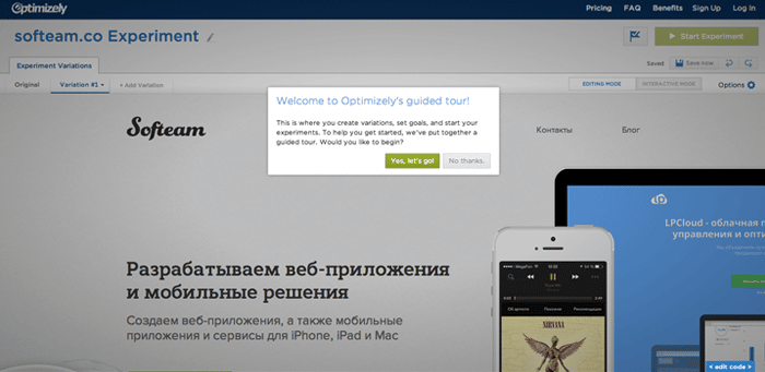
With the demo version, users quickly become familiar with the product and get involved in the service. As such, the demo version of your site should always be just a click away from your homepage.
Provide a free trial periodUsers are always interested in seeing the product work so that they can observe first hand how it can resolve their problems. Therefore, most companies offer a trial period of between 14 and 60 days. This approach is used by a large number of the more successful SaaS companies. Some companies post the information about the duration of the trial period directly on the target button. However, recently a lot of companies have started to replace this with the simple words “Try it for free.”
Configure the support serviceDon’t wind up with egg on your face by not paying attention to customer service. Such a tiny thing can ward off your existing customers and turn the potential ones away. In the modern world information travels fast and you really don’t want your organization to become notorious for all the wrong reasons.
Here’s a great example — the customer service department of Zappos provides excellent customer support so it’s almost impossible to find negative reviews about the company. So if fast customer service is one of your strong suits, let everyone know!
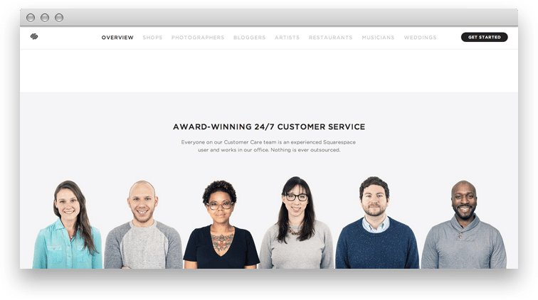
Here are a few quick tips:
Place your phone number or your email address somewhere prominent so that it is easy for customers to notice it. Tell your site visitors about your company’s achievements. Inform people what the average response time is. Show the faces of the actual people who work in your customer service department.
Reassure users that they are safe with youMake sure the data that the legal entities and individuals confide in you is safe. The violation of safety rules can lead to the users’ discontentment and to the loss of their trust. Tell your clients what you do to keep their data safe. They don’t have to know all the details, just familiarize them with the general principles and technologies so that they are assured their information is safe with you.
In conclusion:We’ve just talked briefly about the most common and efficient tools for marketing web applications and increasing conversion rates. They are pretty efficient individually but once you find the right concoction, you’ll be able to significantly increase conversions and profitability. Don’t be afraid to experiment and find what works for your project.
As always, we’re always ready and willing to give you a hand here at A2 Design. Get in touch with us today!


